A reference library Claude scores, and a visual brief that finds what a client actually likes, not just what they say.
- For
- Amplifier, the small design studio I’m a partner in
- My role
- Research, design and build
- When
- Rebuilt October to November 2026 (first version 2025)
- Used by
- Our three designers; clients on their phones, through a private link or the studio’s site
- Status
- Brief and library in testing with the studio; the site in progress with Francis
- Built with
- Next.js 16, Supabase (Postgres, row-level security, pgvector), Claude Sonnet and the Message Batches API, Voyage multimodal embeddings, a Chrome extension
The problem
“Minimal” can turn out to mean calm rather than empty.
Clients usually know what they like when they see it, but the words they use for it can point somewhere else. The first meeting is where that gets untangled, and we were walking in with a few adjectives and a guess.
The 2025 version of Amplifier tagged our reference library and turned a client questionnaire into keywords. It worked, but creating and maintaining tags was a chore, so nobody kept them up, and the brief could only match the words a client typed. In October 2026 I rebuilt it from scratch around two ideas: describe the library with definitions instead of tags, and learn what a client likes from what they choose.
- For a client to finish the brief on a phone
- ~8 min
- This-or-that pairs, each aimed at what it’s least sure of
- ~20
- Right side of each dimension, with simulated clients
- 91–95%
- Before a client’s private link expires
- 30 days
Which feels closer?
Each pair changes one thing and keeps the rest the same.
Which feels closer?
A small version of the brief. Say what you want in words, then pick between eight pairs. The next pair goes after whatever it’s least sure about. The images here are shapes drawn from numbers; the real brief uses the studio’s library.
First, in words: what should it feel like? Pick a side where you have a view.
Which feels closer?
In Amplifier, the numbers decide which gaps are worth raising and Claude writes the wording. Here the wording is fixed.
The brief
About eight minutes on a phone. No account, no app.
One brief, link to first meeting: pick a station
01A link, or the site
- Who
- The studio, or a visitor to the studio’s site
- Before
- A client questionnaire, turned into keywords.
- Now
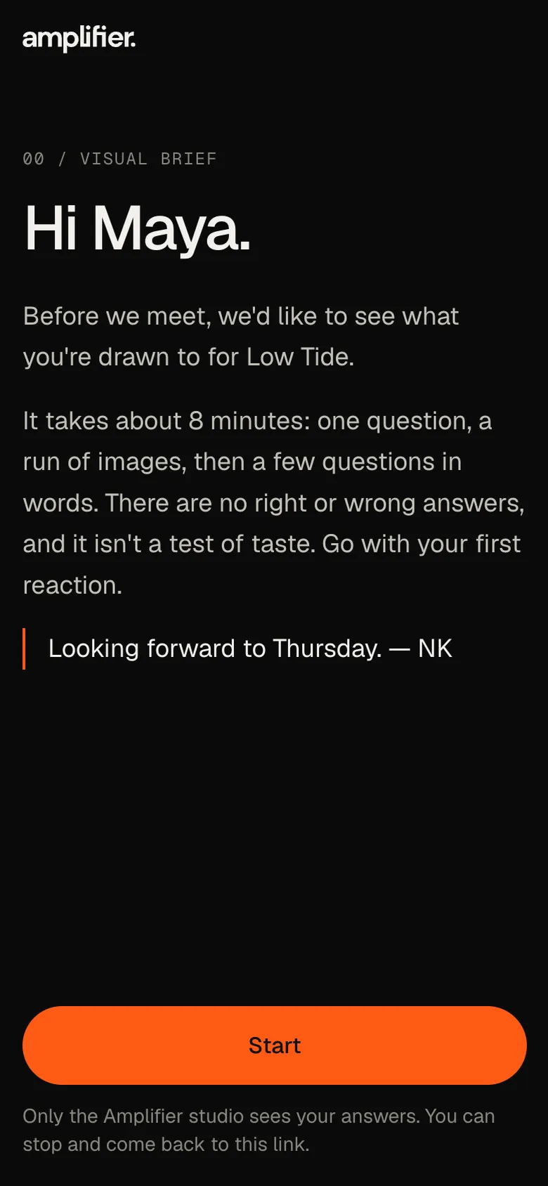
- The studio sends a private link that expires after 30 days, or a visitor starts one from the site with a name, email and project type. No account, no app.
- Where
- The client’s phone
02Welcome and one question
- Who
- The client
- Before
- A few adjectives in a questionnaire.
- Now
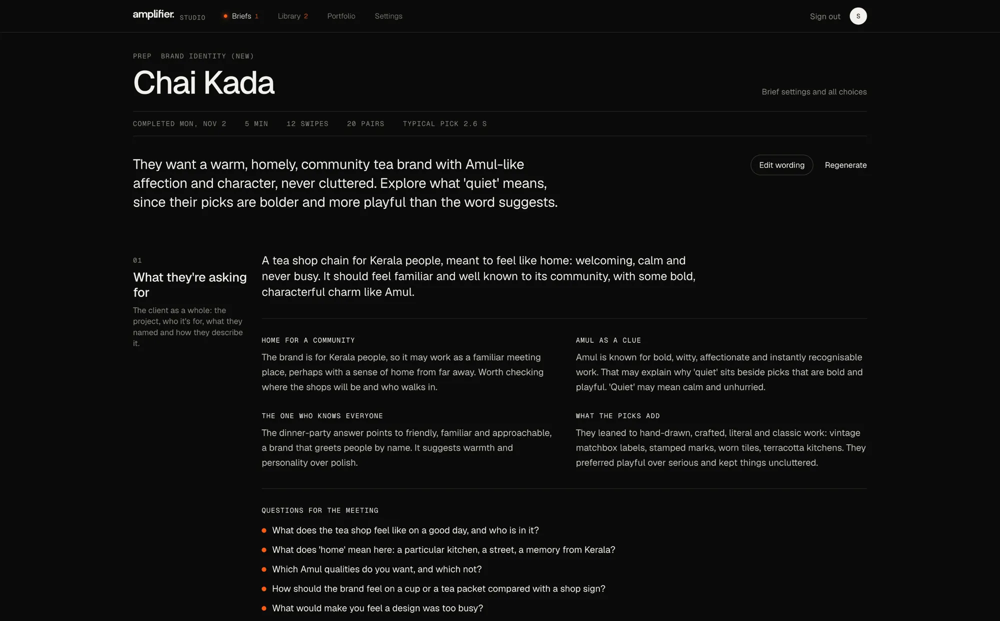
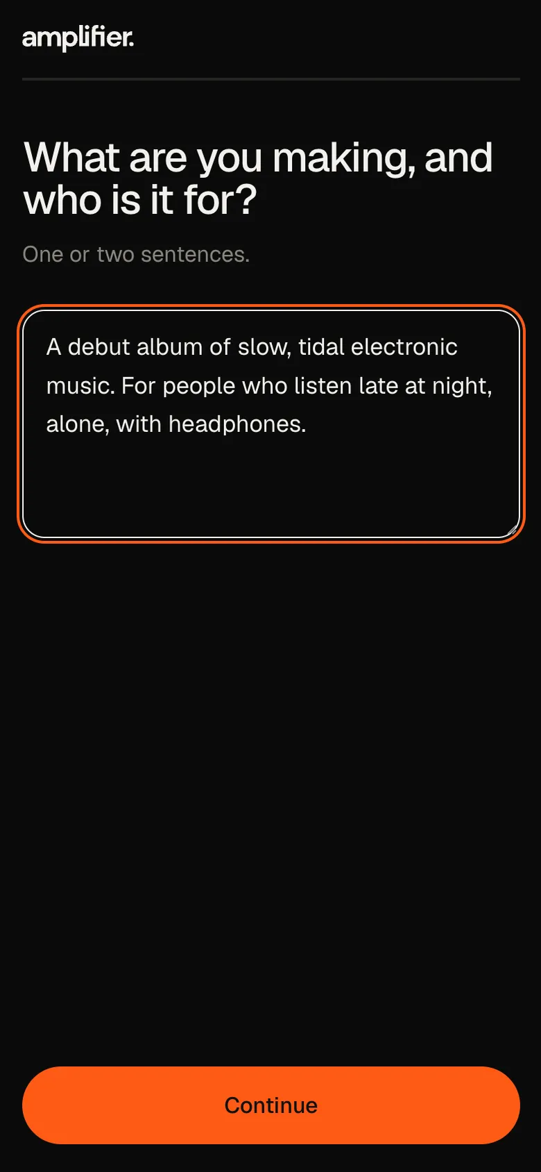
- A short personal note, then one question in words: what are you making, and who is it for? The answer picks the images: about three quarters are the library images closest to it, the rest open to anything.
- Where
- The client’s phone
03Warm-up
- Who
- The client
- Before
- The brief could only match the words a client typed.
- Now
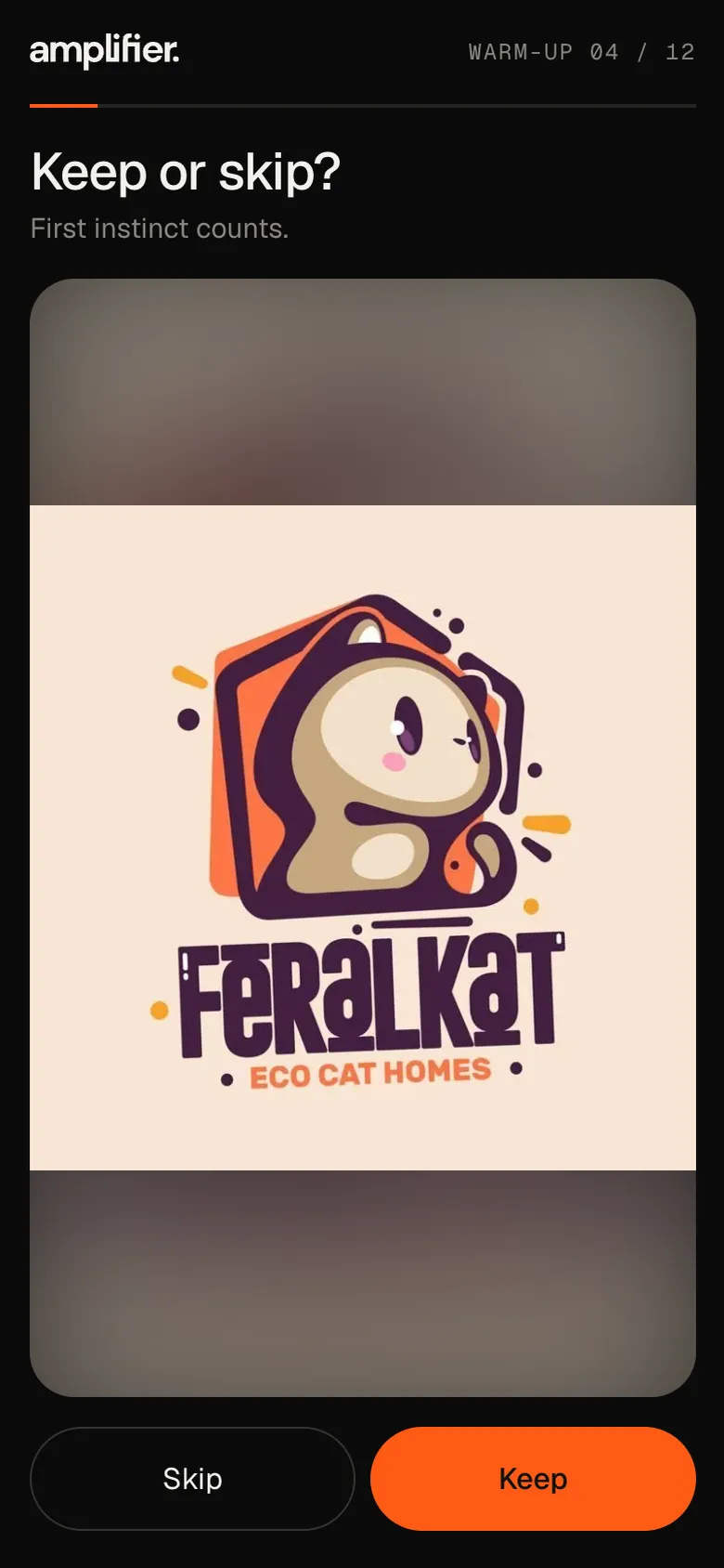
- Twelve images to keep or skip. Answers save in the background, so swipes feel instant.
- Where
- The client’s phone
04This or that
- Who
- The client
- Before
- Keywords matched against tags nobody kept up.
- Now
- About twenty pairs, each aimed at the dimension the system is least sure about, using two images close on everything else. A few come back with the sides swapped to check the answer holds.
- Where
- The client’s phone
05Early read
- Who
- The studio
- Before
- Keywords from the questionnaire.
- Now
- As soon as the client finishes: where each choice leans, how unsure it still is, and how many repeated pairs got the same answer.
- Where
- The studio’s brief page
06First meeting
- Who
- The studio and the client
- Before
- A few adjectives and a guess.
- Now
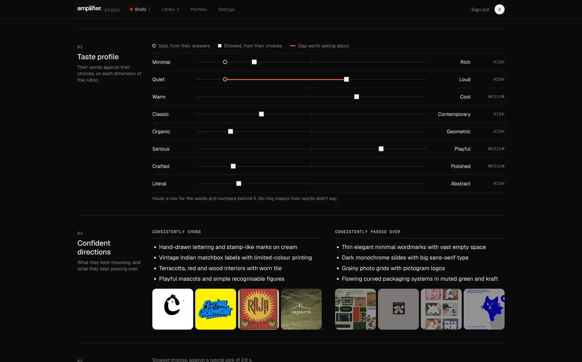
- The prep page, screen-shared: what they’re asking for, where their words and picks really differ with a question to ask, the taste profile, hesitations and a starter moodboard.
- Where
- The first meeting
Now and then a quick “what caught your eye?” offers a few chips to tap, and the remaining questions in words come at the end, then a thank-you with the meeting date. I tested the engine with simulated clients before any real one saw it. With a library of 100+ images, it picks the right side of each dimension 91–95% of the time.
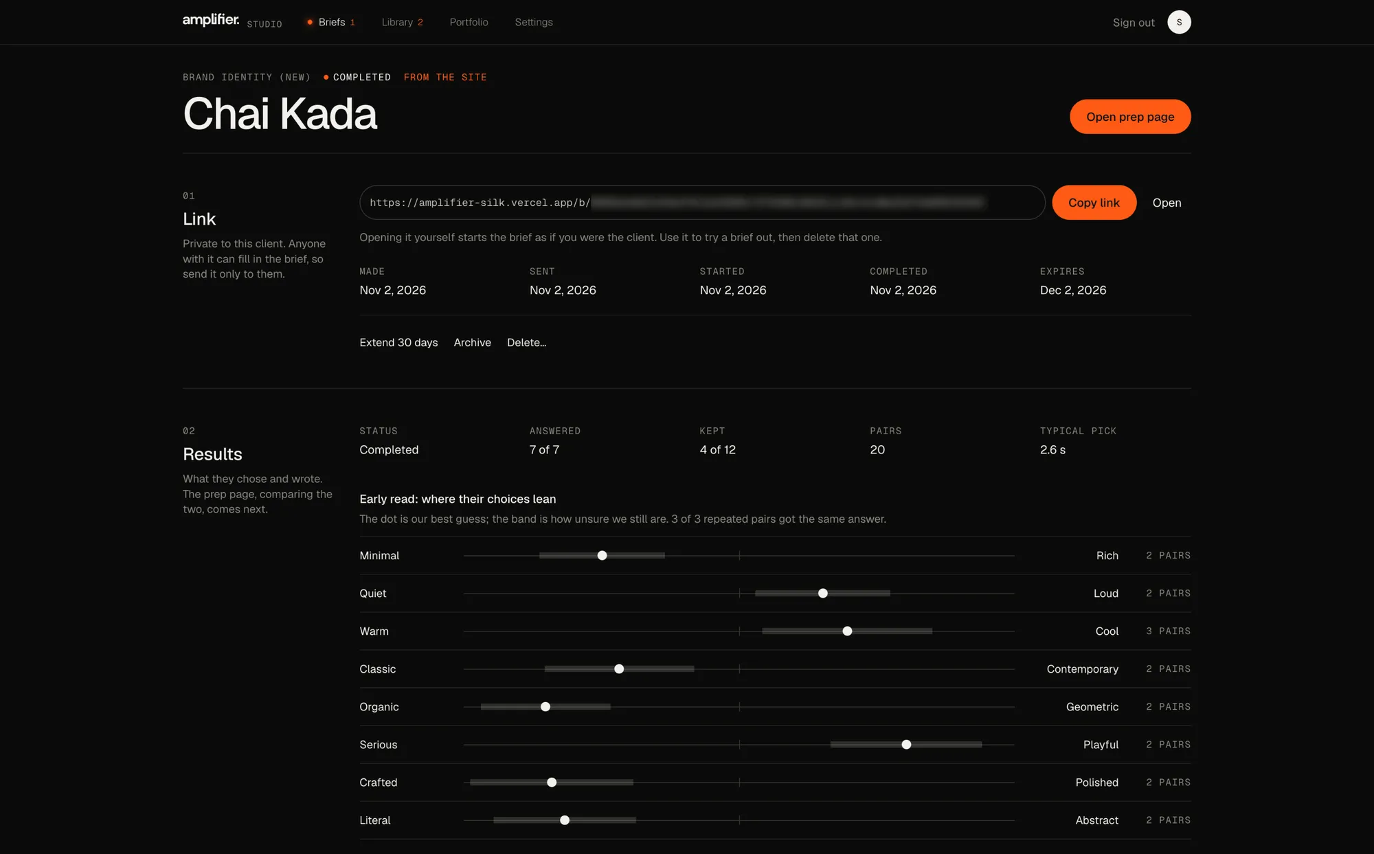
The prep page
Read the client as a whole, then compare looks.
When the client finishes, the prep page builds itself. It’s made to be screen-shared in the first meeting.
- What they’re asking for comes first: a summary of the whole brief, notes on the project, on what a reference they name stands for (as something to check), on their character and on how their picks fit, and questions for the meeting. Editable like the rest.
- Said against showed, on every dimension of the rubric. Their words go on a visual scale only when they’re about the look, so feeling-words like “warm” or “quiet” stay off it, and placements Claude isn’t fairly sure of are left out.
- Differences, not just gaps. Each dimension says whether words and picks agree, differ, or differ in a way their story explains. Only real differences are listed, each with a question to ask, and ones resting on few pairs are marked “Early hint”.
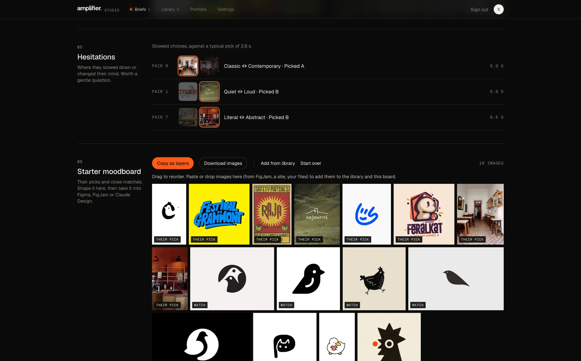
- Hesitations: their slowest picks, and any answer that changed when a pair came back swapped.
- A starter moodboard from their picks and close matches. “Copy as layers” pastes it into Figma as separate layers, and images dropped onto the board go into the library too.
The library
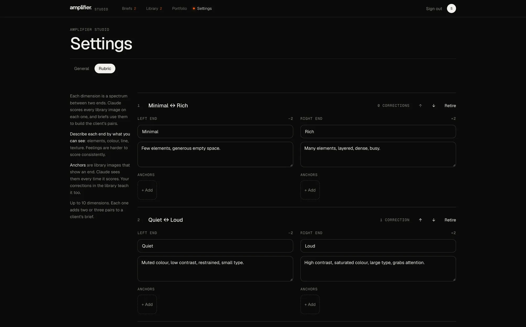
Instead of tags, the studio writes a rubric.
Up to ten dimensions, each a spectrum between two ends, and each end described by what you can see, like elements, colour, line and texture. Claude scores every image on every dimension.
- Anchors: library images pinned as examples of an end. Claude sees them every time it scores.
- Corrections are recorded and fed back into scoring. A designer’s edits are kept when an image is rescored, and changing a definition marks the old scores stale and offers a rescore.
- Embeddings (Voyage multimodal, stored in Postgres with pgvector) power “More like this” and catch near-duplicates on upload, alongside exact hash matching.
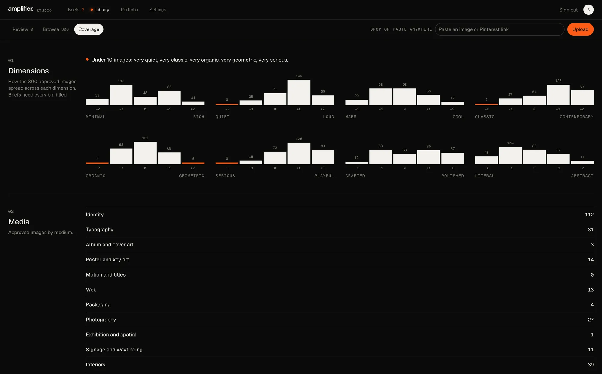
- Coverage shows which ends of which dimensions need more images, because the brief needs every end filled.
- Pinterest boards come in whole: the Chrome extension reads a board in the designer’s own browser and sends each pin, labelled with who imported it and the board’s name.
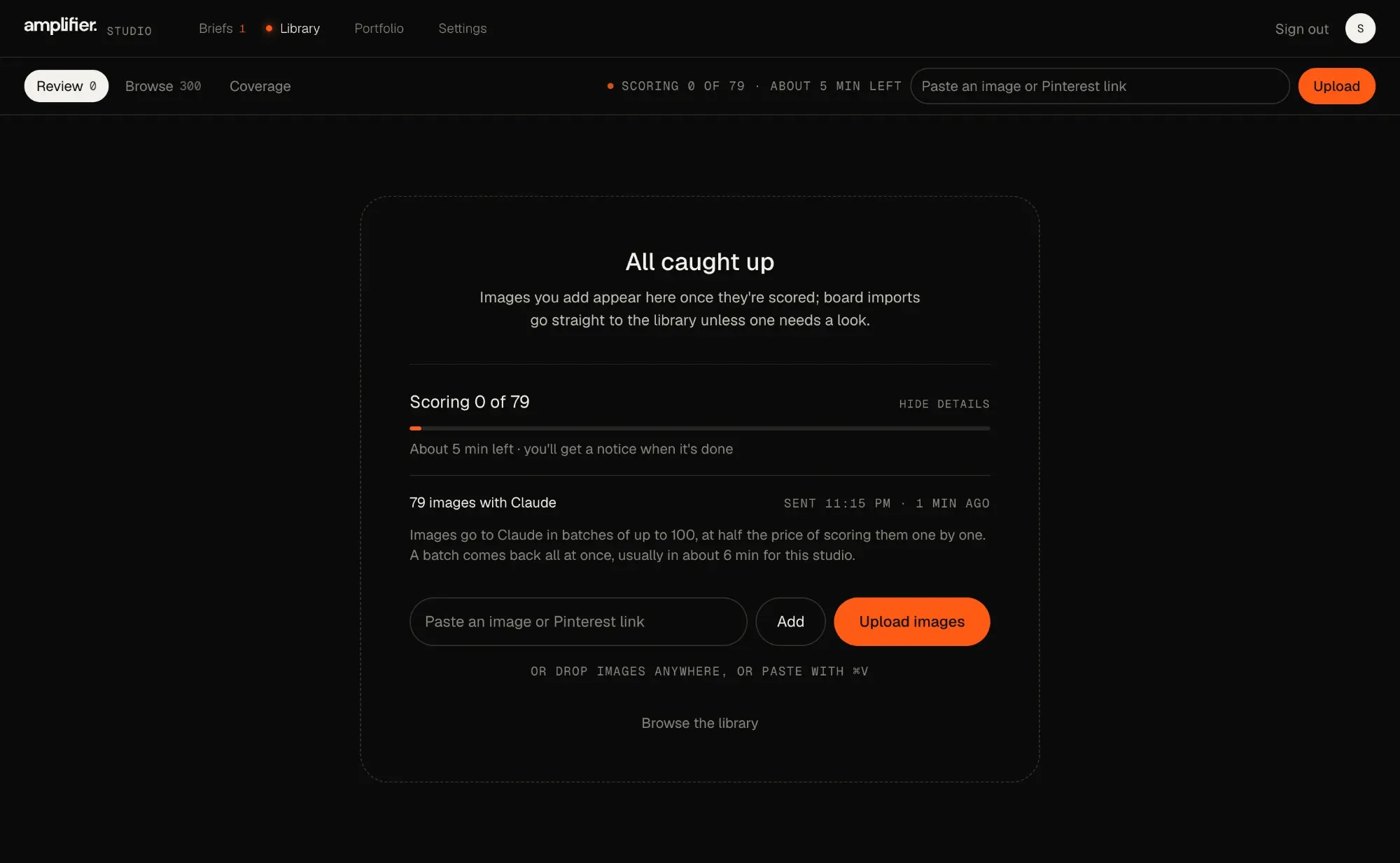
- Scoring in the background through Anthropic’s Message Batches API, at half price and usually within the hour, with a count like “Scoring 0 of 79”, a bar and about how long is left.
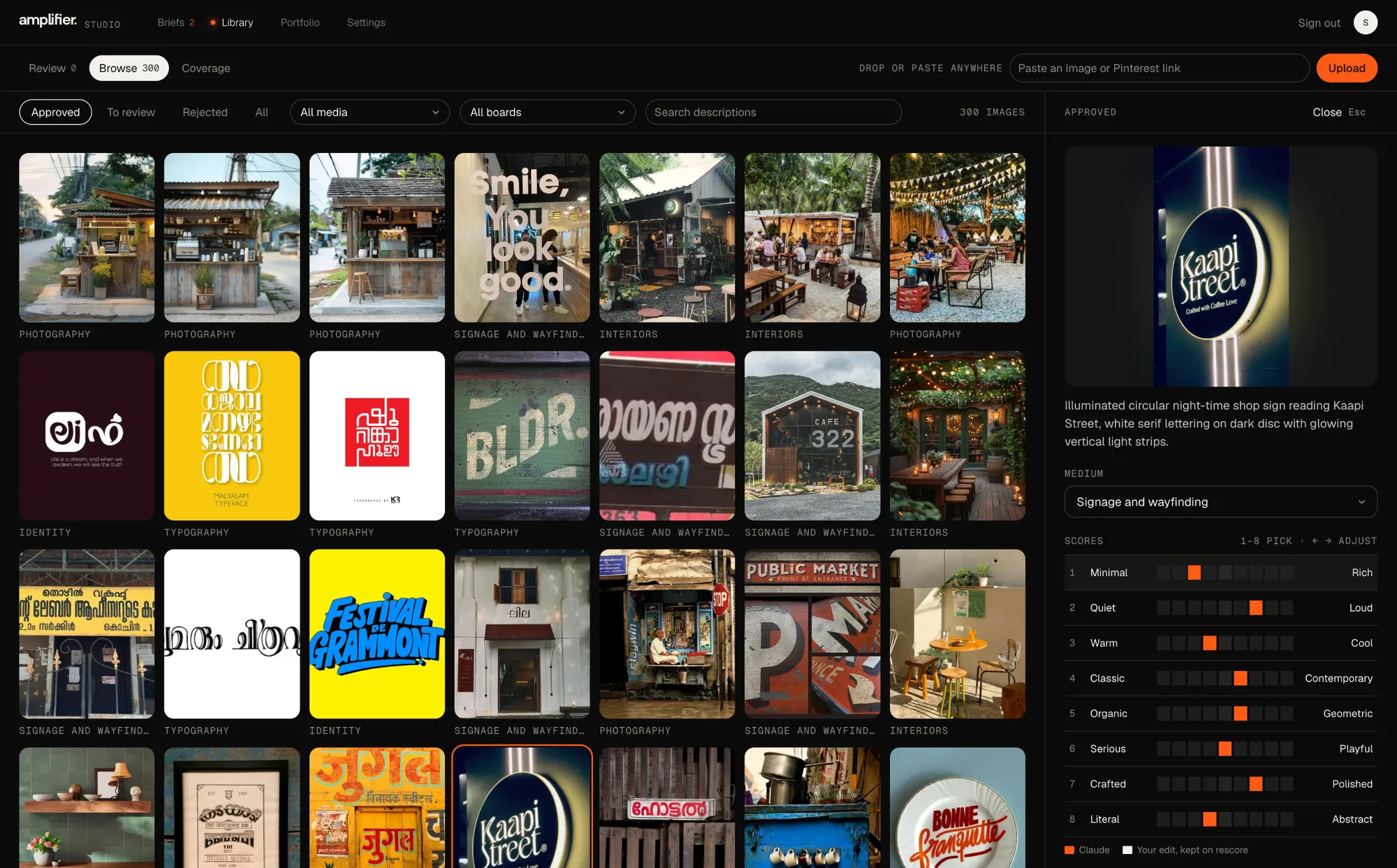
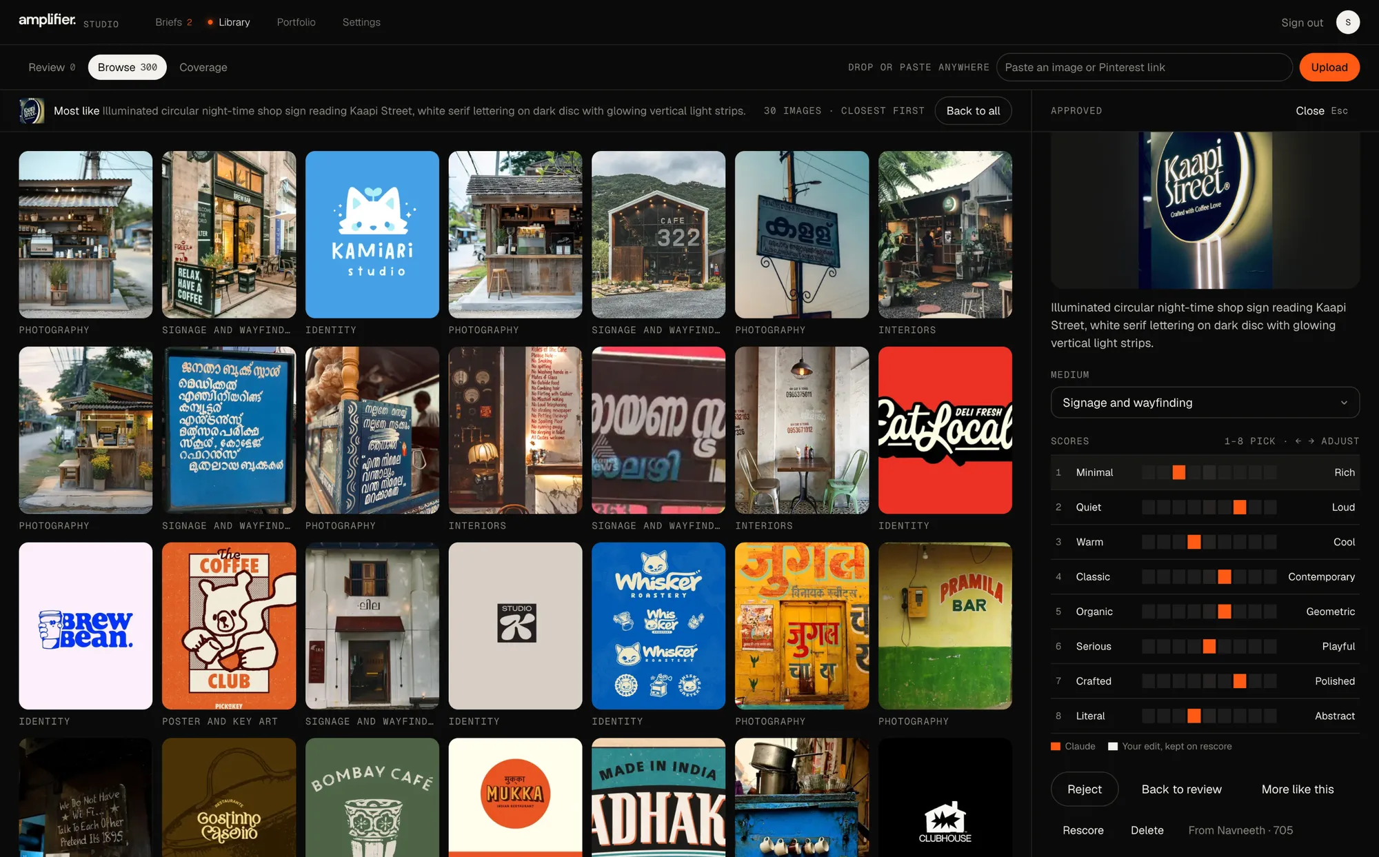
Library images are saved references by other designers, shown as they appear inside the studio’s tool.
The studio site
In progress: not launched yet
One app now runs the studio’s site, the brief and the library.
The studio’s new public site is being built in collaboration with Francis, the designer, on top of Amplifier. Projects are written in Studio › Portfolio: details, images and video, and a case study made of text and media blocks, with a French version beside each one.
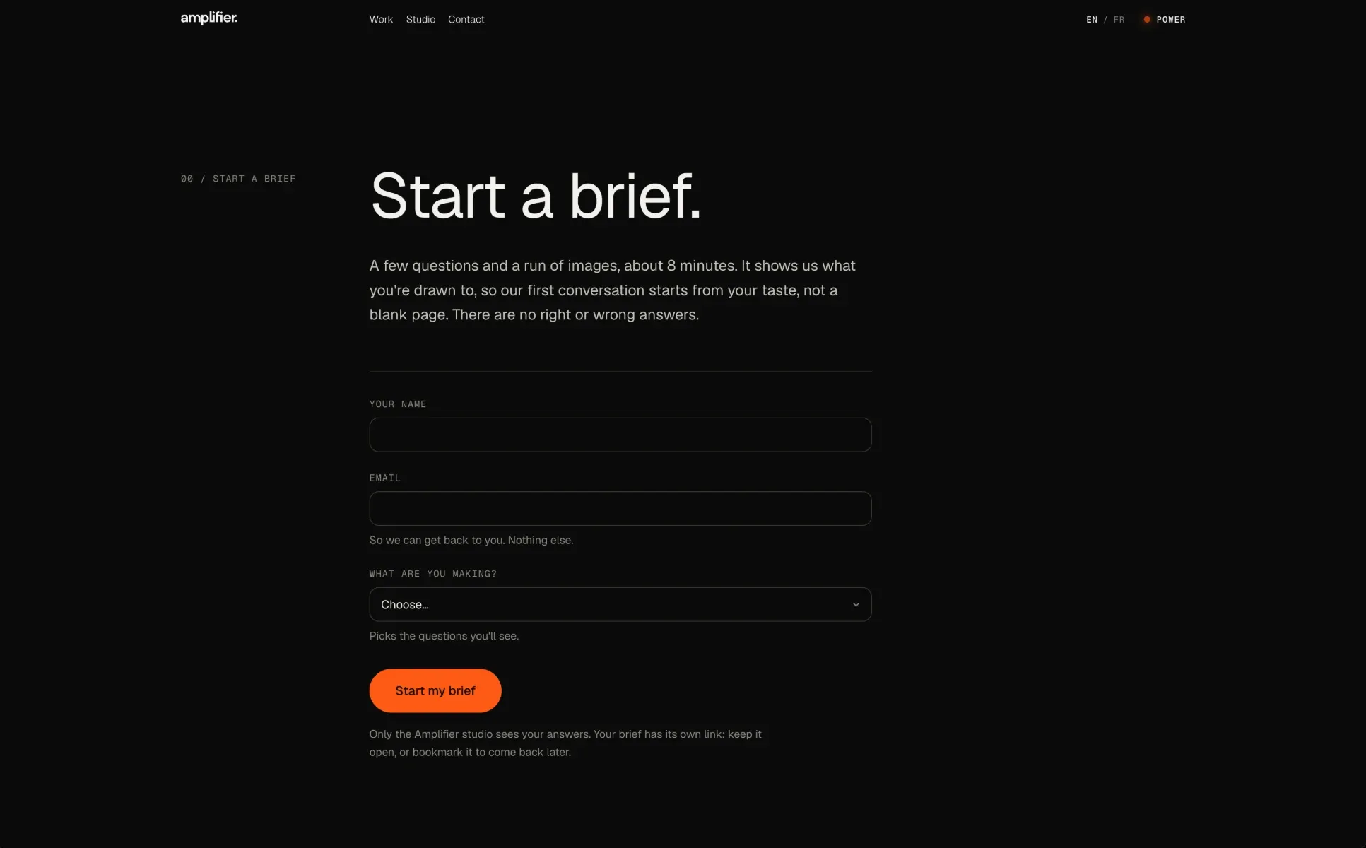
Every page can also start a brief. A visitor gives their name, email and project type and goes straight into their own visual brief, marked “From the site” in the studio. Until launch, amplifier.studio still serves the old site.
What changed after feedback
Using it with the studio changed what the report reads, and how the library keeps up.
- 22 Oct
The studio takes on any client, not only artists.
Project types for brand identity, website, packaging, signage, campaigns, releases and events. A brief’s images now start from the client’s own answer to “What are you making?”, and whole Pinterest boards can be imported.
- 1 Nov
Imports slowed the whole studio down.
One scoring run at a time, time limits on every call, and batches that carry links instead of image files. The library shows where scoring is up to, and an idle studio leaves the database alone.
- 1 Nov
“Every project starts with a visual brief,” so the site needed a way in.
A start form on the site, with limits instead of an account.
- 2 Nov
The report only placed the client’s words on the visual rubric and called the differences contradictions.
It now reads the whole brief first, keeps feeling-words off the visual scales, leaves out placements Claude isn’t fairly sure of, and only lists differences their story doesn’t explain.
- 3 Nov
Some imported images sat at “scoring” forever.
Images whose adding was cut off part-way are finished automatically, and the ones that can’t be are listed in Review with Retry and Remove.
Decisions
Definitions instead of a tag vocabulary
The first version’s tags were never maintained because creating them was a chore. A rubric is a handful of definitions the studio writes once. Claude does the scoring, and anchors and corrections keep it close to the studio’s eye.
A deterministic engine, tested before any client
Choosing the next pair, tracking how sure it is and checking consistency are plain code, not a model. That meant I could run simulated clients through it and know it worked before a real client ever saw it.
Read the whole client, then compare looks
A difference between words and picks is only listed when the words are about the look, Claude is fairly sure where they sit, and their story doesn’t explain it. Ones resting on few pairs are marked “Early hint”, so a thin signal never reads as a finding.
Half-price scoring that can’t pile up
Imports are scored through Anthropic’s Message Batches API, with one run per studio at a time, time limits on every call, and batches recorded before they’re sent, so nothing is paid for twice. Embeddings come from thumbnails, in batches, so cost stays low as the library grows.
Limits instead of accounts
Clients never sign up. The studio sends a private link that expires after 30 days, and the site’s start form is checked on every request instead: two briefs a day per visitor (counted by a one-way hash, the address never stored), one open brief per email, twenty a day across the site, plus a hidden field and a timing check for bots.
Where it is now
- Status
- Brief and library in testing with the studio using test briefs; the site in progress with Francis
- Tested
- Right side of each dimension 91–95% of the time, with simulated clients and 100+ images
- Next
- The first real client briefs, and launching the site
Reflection
The first version taught me that a tag vocabulary nobody maintains is worse than none. The rebuild puts the studio’s effort in the one place it pays off, writing definitions, and leaves the repetitive scoring to Claude, kept honest by anchors, corrections and an engine I could test before anyone used it.